Case study · Brad's Deals
Finishing Brad's Deals' move to Nuxt
I joined Brad's Deals as one of four front-end developers on a site split between legacy Rails and a young Nuxt app. Four years later, as the only front-end developer left, I shipped the last Rails page. Along the way I built members-only deals, led the search rebuild and kept redesigns from rotting the codebase.
- role
- Front End → Senior Front End Developer
- period
- Jan 2023 – Nov 2026
- stack
- Nuxt 3, Vue, TypeScript, Pinia, Contentstack, Vitest, Playwright, Claude Code
- live
- bradsdeals.com ↗
Outcomes
- 01Finished the Rails → Nuxt migration as the sole front-end developer
- 02Member pricing that never ships in cached HTML
- 03Led the search rebuild from first commit to release
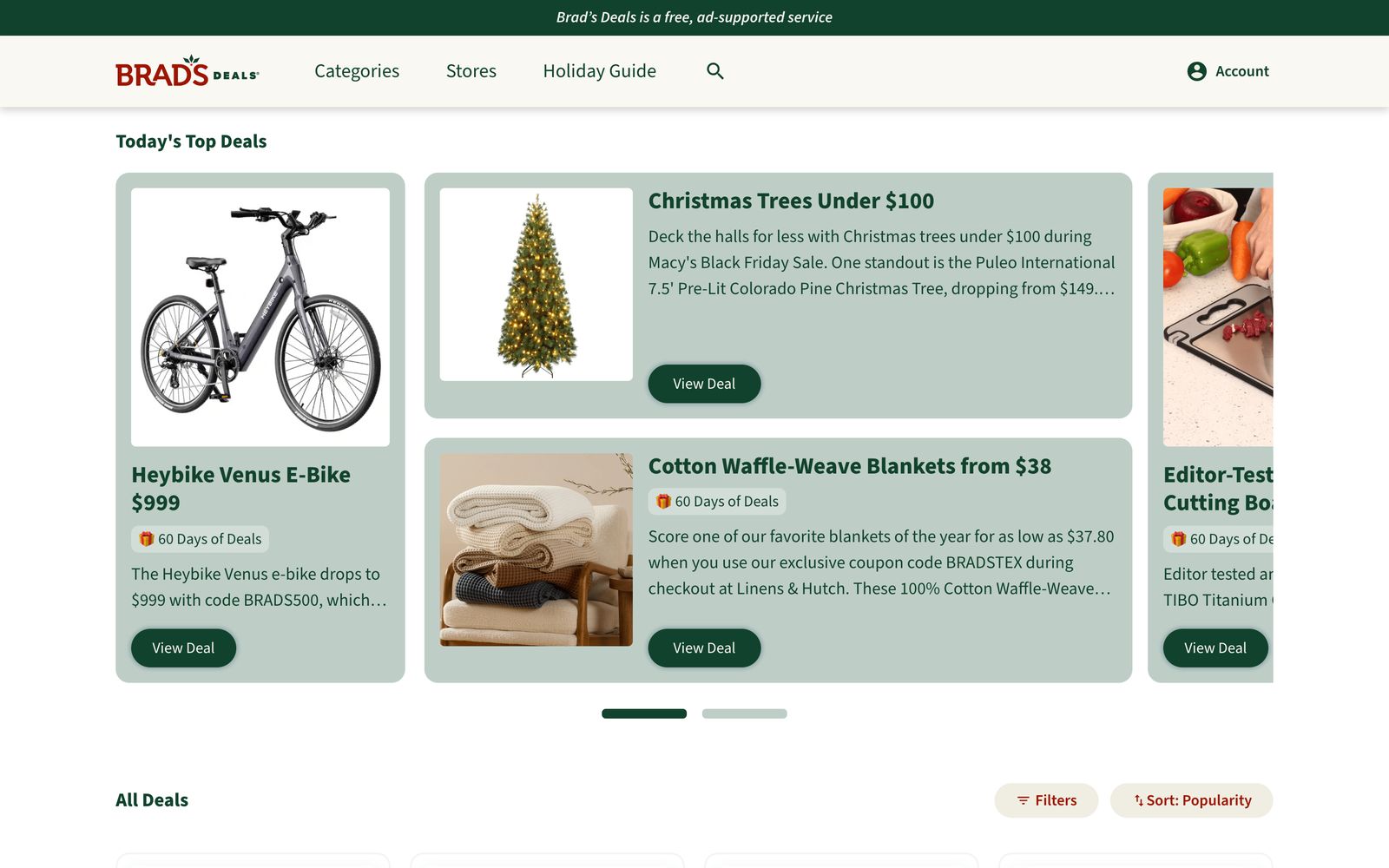
Brad's Deals is a deal-discovery site. Editors find good deals across the internet and post them with a write-up, a price and a tracked affiliate link. Nearly every page on the site is some arrangement of those posts: feeds, grids, sliders, search results, and a detail page for each one.
Finishing the migration
When I started in January 2023, the site was split. A proof of concept had moved a handful of pages to Nuxt, but most of the site still ran on an aging Rails app. Content was split too: editors still worked in a legacy CMS while new content types were being modeled in Contentstack. The goal was a modern Vue and Nuxt front end: easier to hire for, nicer to build in, with server rendering for SEO and app-like navigation once it loads.
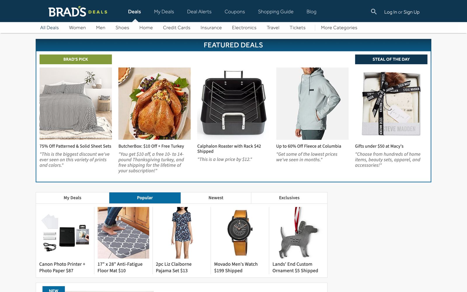
Nov 2022 · Rails
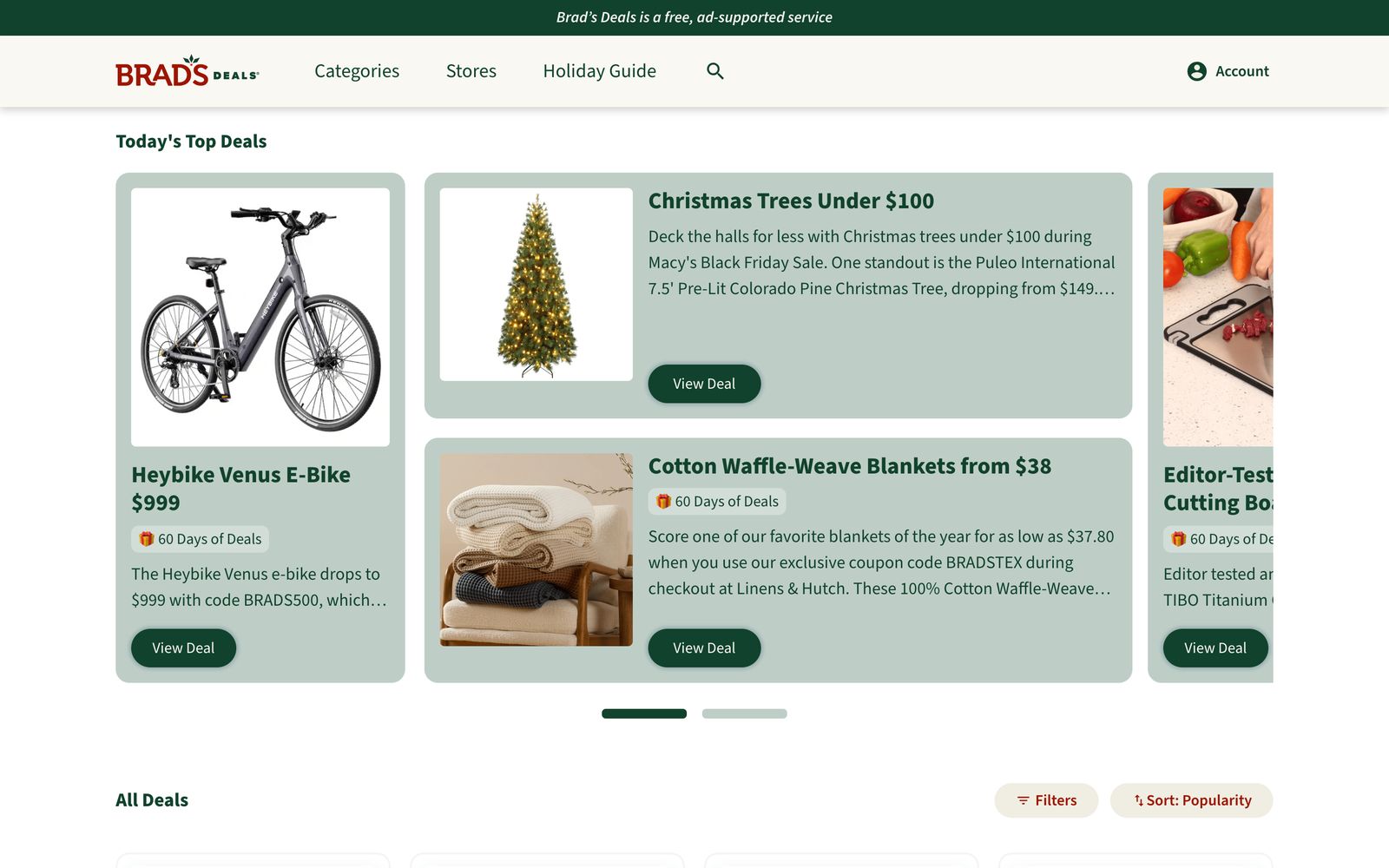
Nov 2026 · Nuxt
I joined a team of four front-end developers. The Nuxt 3 and Pinia foundations were already in place, so my early work was building out the patterns we needed as more content moved into Contentstack: receiving each new content type, normalizing it, and rendering it alongside data from the older systems.
The work came in waves:
- Moving the content-driven pages off Rails
- Moving the deal feeds onto the new search API
- A post detail page refresh
- The acquisition modal and social sign-on
- A search page rebuild
- A homepage redesign and migration
- A new color palette and a second post detail refresh
- Members-only deals
- Email preferences, the last page on Rails
Partway through, the team got smaller. There were two of us by March 2025, and from February 2026 I was the only front-end developer. I worked with a full-stack Contentstack developer, a backend developer, DevOps, product, design and QA. In November 2026 I shipped the email preferences page, the last piece of the site still served by Rails.
That last piece was bigger than it looks. Every marketing email already sitting in subscribers' inboxes links to one-click actions like "switch to weekly" or "unsubscribe from promotions", so those URLs had to keep working exactly as before. I rebuilt the preference center in Nuxt and moved the one-click actions into server routes that apply the change and redirect with a confirmation. Both talk to the users service with server-side credentials, so no secrets reach the browser. I also hardened two things along the way: redirect paths are validated so the links can't be used as open redirects, and unsubscribes relayed to the email platform go through a stricter host allowlist than the Rails version had.
This is also where AI changed how I work. I gave Claude Code the list of URLs and behaviors the migration had to cover and pointed it at the old Rails code. Because the Nuxt codebase had well-established patterns, it drafted most of the port in that style. I reviewed and reworked the code by hand, tested every flow myself, and had it help write the Playwright tests that now guard those links.
One source for every deal
Posts are the core data of the site, and for a long time they arrived from three places: Contentstack, a legacy search service and a newer search API. Each returned a slightly different shape. The team's architecture, which I built on and extended, converted posts from Contentstack and the search API into one record shape and stored each one once in Pinia. Deals from the legacy service lived in their own model until it was retired. Feeds stored only lists of post IDs. Tiles, sliders and detail pages all read from the same store.
My first big project was moving the deal feeds onto this model. Editors define a feed in Contentstack as a query: stores, brands, categories, sort order. The app translates that query into a search API request, normalizes the posts that come back, and renders them as horizontal sliders or filterable grids.
The homepage shows how the pieces fit together:
On the server · anonymous, cached at the CDN
- 01
Contentstack
Page arrives as a list of content blocks. The first few render on the server; the rest render as they near the viewport. - 02
Contentstack
The featured placements block holds references to posts by ID only, not the posts themselves. - 03
Search API
One batched request turns those IDs into full posts. - 04
Search API
The deals grid below asks for its own feed, minus the posts already featured above it.
one record per post
Pinia store
feeds hold IDs only;
tiles read reactively
In the browser · personalized
- 05
Users service
The session is restored in the browser, never on the server. - 06
Search API
If the visitor is a member, one batched request reveals member-only prices in place.
The hard part was making sure each post was loaded once per session, even when the same post was featured at the top of the homepage, appeared in the grid below it and then opened on its own page. A few rules handled it:
- A request that's already in flight is reused instead of repeated.
- A thin preview of a post never overwrites the full version.
- The post detail page always asks for the authoritative full record.
Over time the team moved every post onto the search API, and in 2026 the legacy service and its separate model were retired. That removed a whole class of "which version of this post is this?" bugs.
Hydration was the main source of layout shift. Below-the-fold blocks render as they approach the viewport, and feeds load without blocking the page, so content kept arriving after first paint and pushing things around. Ads made it worse. I built skeleton loaders that match each tile layout exactly, so content fills a space that's already reserved instead of shoving the page down. Each release, I watched Core Web Vitals in Datadog and fixed regressions as they appeared, and I checked Lighthouse as I built rather than in a cleanup pass at the end.
Members-only deals that don't leak
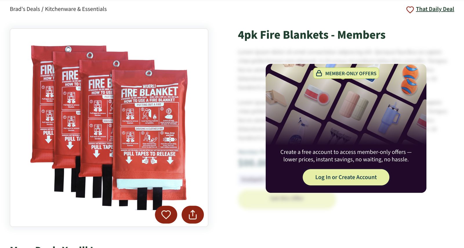
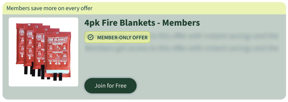
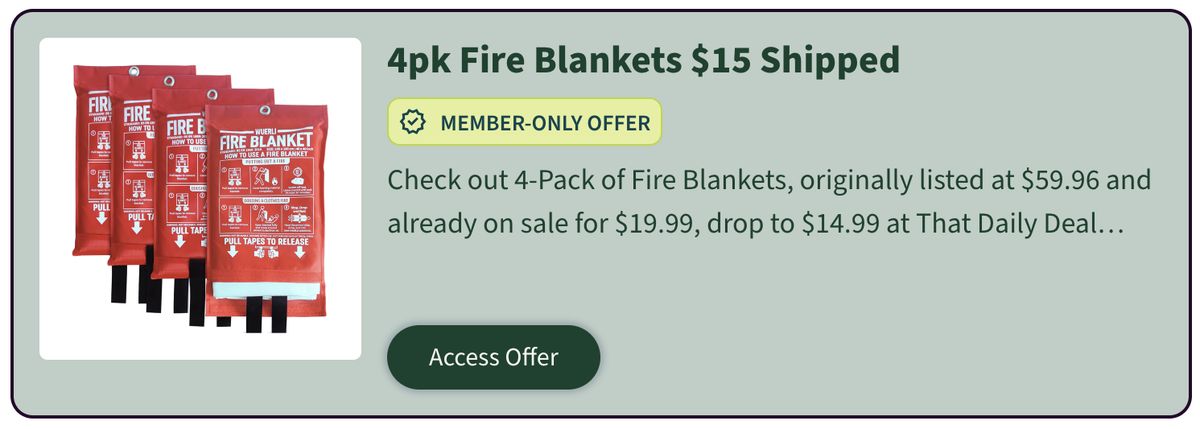
Product wanted to put some of the best deals behind a free account, so they'd drive sign-ups. Logged-out visitors see a member-only post with its price and details hidden behind a prompt to join. Members see everything.
The easy version is a blur over the real price. My first implementation did exactly that, and when I wrote the architecture decision record for it I noted the catch plainly: the real price was still in the page's data payload, visible to anyone who opened dev tools. It was concealed, not protected.
The fix was to make the server the gatekeeper:
- Masking happens at the API. The search API removes member prices unless the request carries a member's token. Server rendering always runs anonymously, so the HTML cached at the CDN never contains a member price.
- The locked view can't leak. It renders a decoy with fake text and a fake price, and the component doesn't accept real post data at all.
- The token never touches the server's shared state. It lives only in the browser, so one visitor's session can't bleed into another visitor's server-rendered page.
Logged out
Logged in
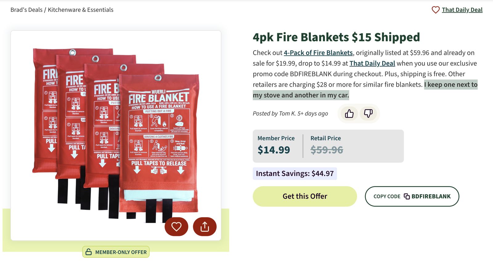
The interesting work was the reveal. A homepage might show a dozen member-only tiles. After login, a client-side plugin collects every masked post on the page and reveals them all with one batched request, then updates their records in the store. Every tile showing those posts re-renders on its own, and nothing else is refetched. On logout the same path runs in reverse and re-masks them. To avoid a jarring locked-then-unlocked flash for returning members, the featured block holds a skeleton briefly while a reveal is likely, capped at 2.5 seconds.
Logged out
After login
Around membership I also built the acquisition experience. I helped shape the content model in Contentstack so marketing could create modal variants (headline, copy, call to action, layout) and launch campaign-specific versions from a URL parameter without a deploy. The modal waits until the visitor has started scrolling, skips logged-in users and known subscribers, and limits how often it appears. A dedicated membership drawer followed for member campaigns. I integrated sign-on with Google (including One Tap), Facebook and Apple against the users service, with every provider ending in the same session handling.
Rebuilding search
I led the rebuild of the search results page, released in August 2024. Results load from the search API in pages of 12, with sort options and filters for brand, store, category and gender. The filter options come from the search response itself, so they always reflect what's actually in the results. Active filters show as removable chips.
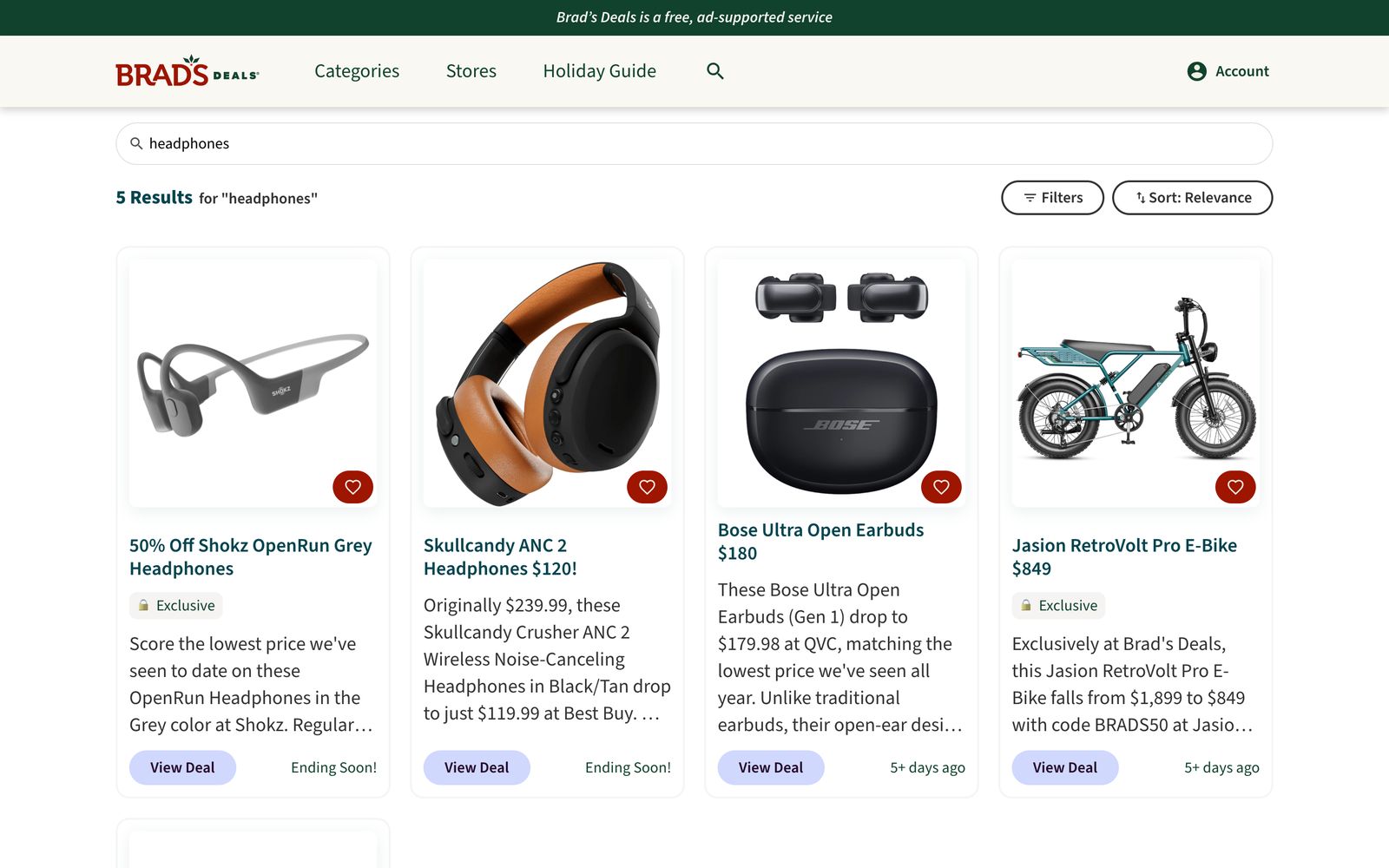
The URL is the source of truth. Every search, filter and sort is reflected in the query string, so results can be shared and bookmarked, and the back button behaves the way people expect. Empty results fall back to top categories instead of a dead end. I also added store suggestions to the search bar's autocomplete.
Redesigns without rot
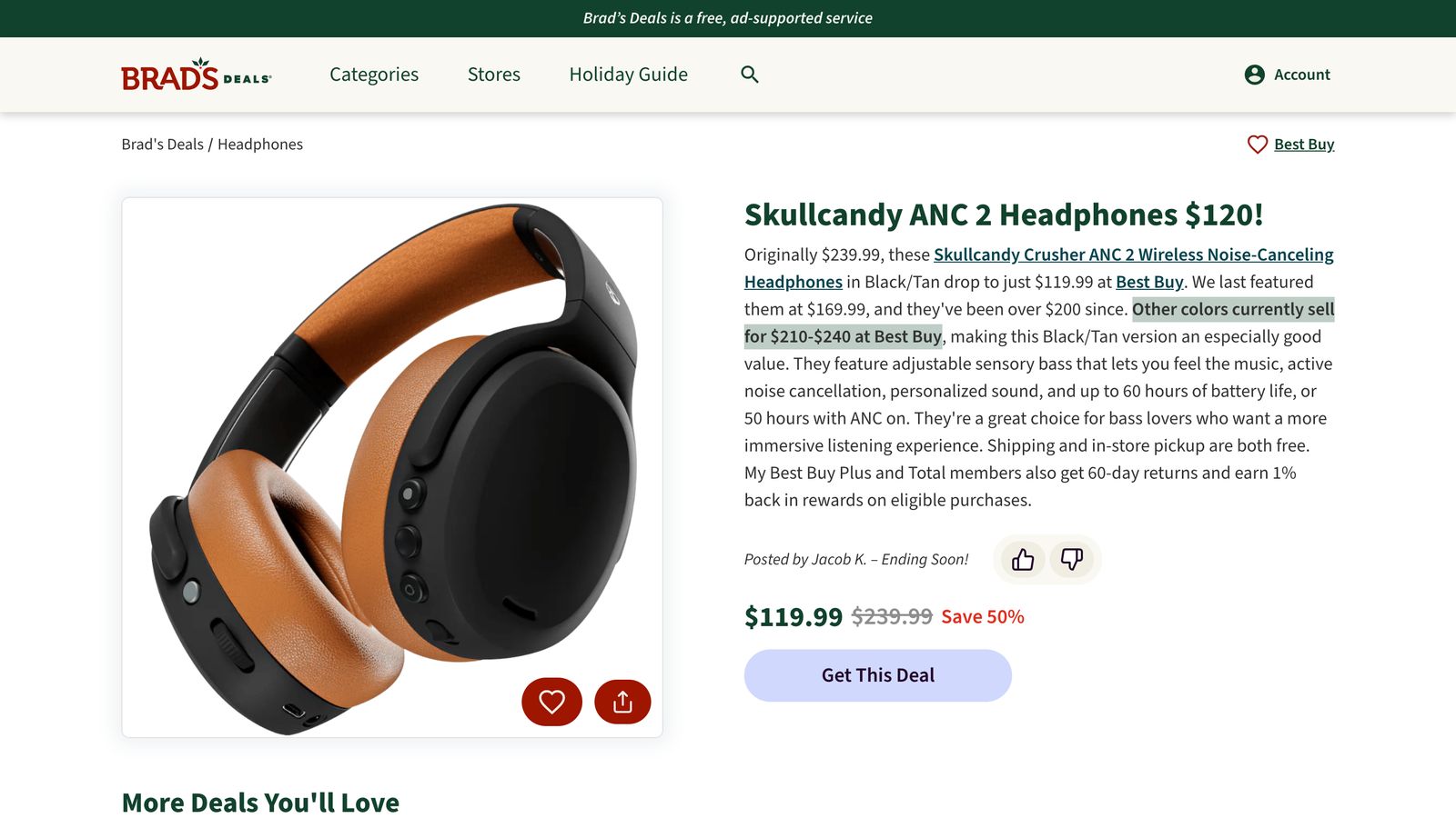
The post detail page was redesigned more than once, driven by product and data decisions about what made people click through to a deal. I built each version from a UI designer's Figma files, working closely with her and our QA manager to match designs and pass QA across mobile, tablet and desktop.
Desktop
Mobile
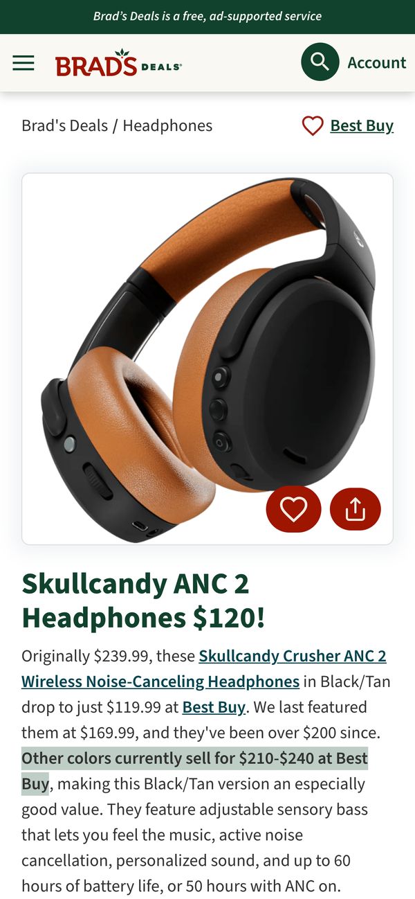
Repeated redesigns are how codebases rot: the new version copies the old component, and both live forever. I kept rethinking the reusable pieces so each redesign removed code instead of adding a parallel copy:
- The price group (member price, retail price, savings) hides the savings line when the discount rounds to 0%.
- The favorite button is a real toggle that announces its state to screen readers.
- The image carousel has labeled controls.
The newest pieces, like deal voting, follow the same rules.
After a site-wide palette refresh, I built the first seasonal theme. That meant moving our colors from hard-coded Sass values to CSS custom properties, and it produced a holiday palette that switches on from November 1 to December 31 (Chicago time), with a feature flag to override the dates. The server decides once whether the theme is active and passes that decision to the browser, so the page never renders one palette on the server and flips to another on load. A test fails if a theme token is defined but never used, or used but never defined. Membership styling is deliberately exempt, so member offers always look like member offers.
How I worked
- Decisions written down. I wrote the codebase's 11 architecture decision records. Several of them, including the membership ones, record where my own earlier decision was wrong and why it changed.
- Tested at two levels. Unit tests cover components, stores and server routes. Playwright end-to-end tests run against a mock API that simulates real behaviors like member-price masking.
- Accessibility as a default.
- Modals return focus to whatever opened them.
- The page behind an open modal becomes inert.
- Loading states announce themselves to screen readers.
- Decorative and decoy content is hidden from assistive tech.
- Measured. Segment events on key interactions; Core Web Vitals monitored in Datadog after each release.
- AI-accelerated, human-judged. From early 2026 I used Claude Code to:
- prototype different approaches to big features
- surface edge cases the acceptance criteria hadn't covered, so I could raise them with product early
- draft code and Playwright tests in the codebase's established style
I owned the problem definition, the review and the final call on what shipped.